Nova Redesign & New Tab Integration
The widget worked, but it was buried on a page nobody visits. Time to redesign it and put it on the new tab.
The Problem
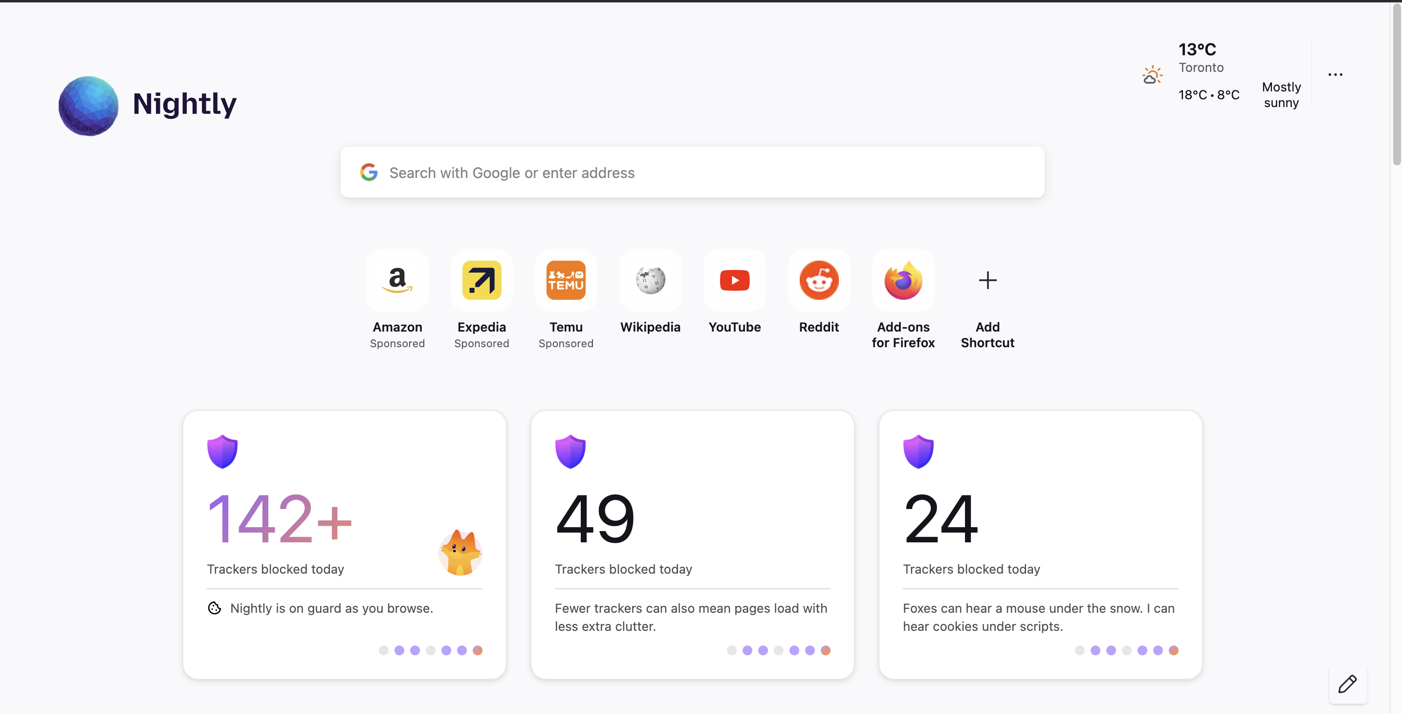
The privacy metrics widget lived on about:protections, a page users have to actively navigate to. Analytics showed most users never visit it. If we wanted people to actually see how many trackers Firefox blocks for them, the widget needed to be on the new tab page, and it needed to look good enough that users would notice it between their shortcuts and Pocket stories.
The existing widget was also a monolith. It fetched its own data, read its own prefs, computed its own display logic, and rendered everything internally. That made it impossible to reuse on the new tab without duplicating the entire thing. I needed to refactor it into something the new tab’s React architecture could drive.
The Design
The Nova spec called for a 332x276px card with a purple gradient shield, a large tracker count, a configurable insight message below a divider, and an optional fox mascot. The count gets a purple-to-orange gradient when it crosses 100 trackers. Three insight variants and three mascot variants combine into nine possible visual states.
I extracted every pixel value from the Figma export SVG. The shield icon sits at (24, 24), the divider is a 284px line at y=175 with color #D7D8E3, the gradient runs from #8C5EFF to #FF8D5B at 135 degrees, and the dot pagination uses 10px circles with #BBA0FF for active states. Getting these exact values from the SVG meant I didn’t have to eyeball anything.
Making It Prop-Based
The biggest architectural change was turning the card into a pure rendering component. The old version did everything:
// Before: the component fetches, computes, and renders
async connectedCallback() {
  super.connectedCallback();
  this.#loadPrefs();
  await this.#fetchStats();
}
The new version takes two props and renders them. No side effects, no async, no pref reads:
// After: pure props, pure render
static properties = {
  state: { type: Object },   // display state from service
  status: { type: String },   // "loading" | "ready" | "error" | "private"
};
This is the React model applied to a Lit component. The parent layer is responsible for fetching data and passing it down. The card just renders whatever it receives. This made it trivially reusable: about:protections sets the props via IPC, the new tab sets them via Redux, and both go through the exact same rendering code.
The Display State Service
All the display logic moved into PrivacyMetricsService.getDisplayState(). It takes optional overrides (for the demo), reads prefs, queries today’s tracker data, and returns a single object that fully describes what the card should look like:
async getDisplayState(overrides = {}) {
  const stats = await this.getTodayStats();
  const total = stats.total;

  const insightVariant = overrides.insightVariant ||
    Services.prefs.getStringPref("...insight.variant", "guard");
  const mascotVariant = overrides.mascotVariant ||
    Services.prefs.getStringPref("...mascot.variant", "hidden");

  return {
    count: `${total}`,
    useGradient: total >= 100,
    insightL10nId: INSIGHT_L10N_IDS[insightVariant],
    showInsightIcon: insightVariant === "guard",
    mascot: mascotVariant,
    mascotSrc: MASCOT_SRCS[mascotVariant] || "",
    mascotInInsight: insightVariant === "fox-fact",
  };
}
The overrides parameter turned out to be the key enabler for the demo grid. Each demo card calls the same service method with different overrides, exercising the exact same code path as production. No mocking, no prop duplication, just different inputs to the same function.
New Tab Integration
The new tab page is React + Redux with webpack bundling. External web components integrate through the ExternalComponentWrapper pattern, which creates a custom element via document.createElement and passes React props as JS properties on the DOM element.
The integration required four pieces:
A registrant that tells the new tab about our component:
export class PrivacyMetricsNewTabRegistrant
  extends BaseAboutNewTabComponentRegistrant {
  getComponents() {
    return [{
      type: "PRIVACY_METRICS",
      tagName: "privacy-metrics-card",
      componentURL: "chrome://browser/content/privacy-metrics-card.mjs",
      l10nURLs: ["browser/protections.ftl"],
    }];
  }
}
A Redux feed that fetches display state and dispatches it:
export class PrivacyMetricsFeed {
  async refresh() {
    const state = await lazy.PrivacyMetricsService.getDisplayState();
    this.store.dispatch(ac.BroadcastToContent({
      type: at.PRIVACY_METRICS_UPDATED,
      data: state,
    }));
  }
}
A reducer to store the state, and a JSX wrapper in Base.jsx that renders the component when data is ready.
The data flow is: TrackingDBService -> PrivacyMetricsService -> PrivacyMetricsFeed -> Redux -> Base.jsx -> ExternalComponentWrapper -> <privacy-metrics-card>. Each layer only knows about its immediate neighbors.
The Demo Grid
For the design review, I built a demo system on about:protections that renders all nine variant combinations in a 3x3 grid. Each card fetches its display state through IPC with different overrides, so the demo exercises the real service code:
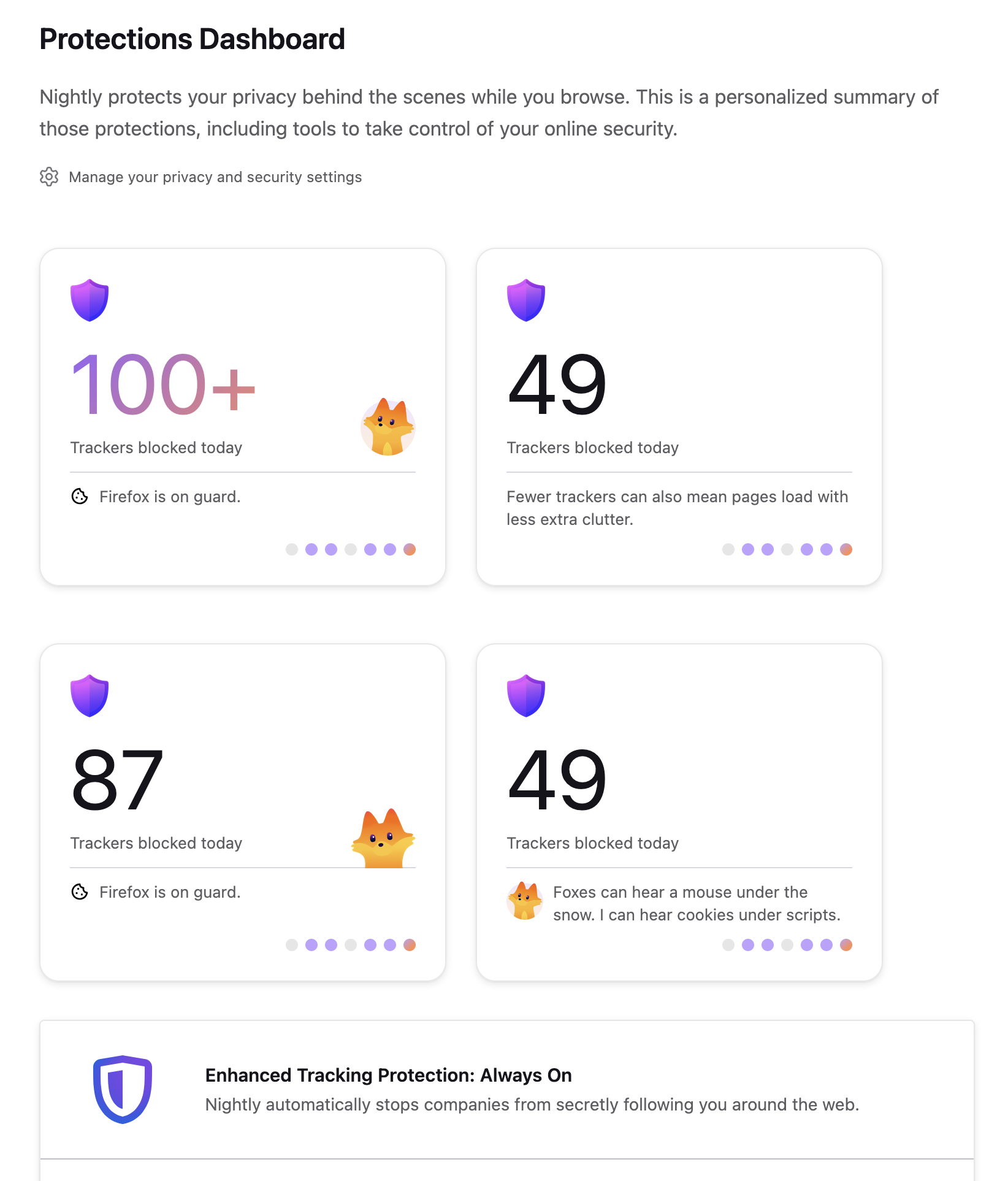
The demo labels show the exact pref combination for each card, so the product team can point to a variant and say “we want this one” without having to understand the code.
What I Learned
Prop-based components are easier to integrate than smart components. The original widget that fetched its own data was fine on about:protections, but it would have been painful to integrate into the new tab. Moving all logic to the service layer and making the card a pure renderer meant integration was just “pass the right props”, whether from IPC or Redux.
Figma SVGs are a specification. Instead of eyeballing the design, I extracted exact coordinates, colors, and dimensions from the Figma SVG export. The shield is at (24, 24), the divider is 284px wide at y=175 with #D7D8E3, the gradient is 135deg from #8C5EFF to #FF8D5B. Treating the SVG as a spec eliminated design review back-and-forth.
The External Component Registry bridges React and Lit cleanly. Firefox’s new tab is React, but the ExternalComponentWrapper creates web components imperatively and passes props as JS properties. This means a Lit component can live inside a React layout without either framework knowing about the other. The wrapper handles lifecycle, l10n link injection, and cleanup.
Overrides beat mocks for demos. Instead of a separate demo component with hardcoded data, the demo sends real IPC requests with override parameters. This means the demo can never drift from production behavior, because it’s running the same code with different inputs.