Predicting the Cost of Blocked Tracker Requests from Pre-Response Features
Full paper (PDF) | Mozilla presentation, April 29 2026 (PDF)
Firefox Enhanced Tracking Protection blocks third-party tracker requests against the Disconnect list, but the privacy dashboard treats every blocked request identically. a 258-byte tracking pixel recieves the same weight as a 170KB JavaScript SDK consuming 305ms of main-thread CPU time. This work develops a machine learning pipeline that predicts the transfer size of individual blocked requests from pre-response features alone, enabling Firefox to surface quantified performance cost estimates to its 250 million daily active users.
Problem Formulation
The core challenge is a training-deployment gap: the response features that determine cost (Content-Length, transfer encoding, execution time) are unavailable at the moment Firefox blocks the request. The model must predict from pre-response signals only — URL structure, resource type, request priority, and domain-level statistics.
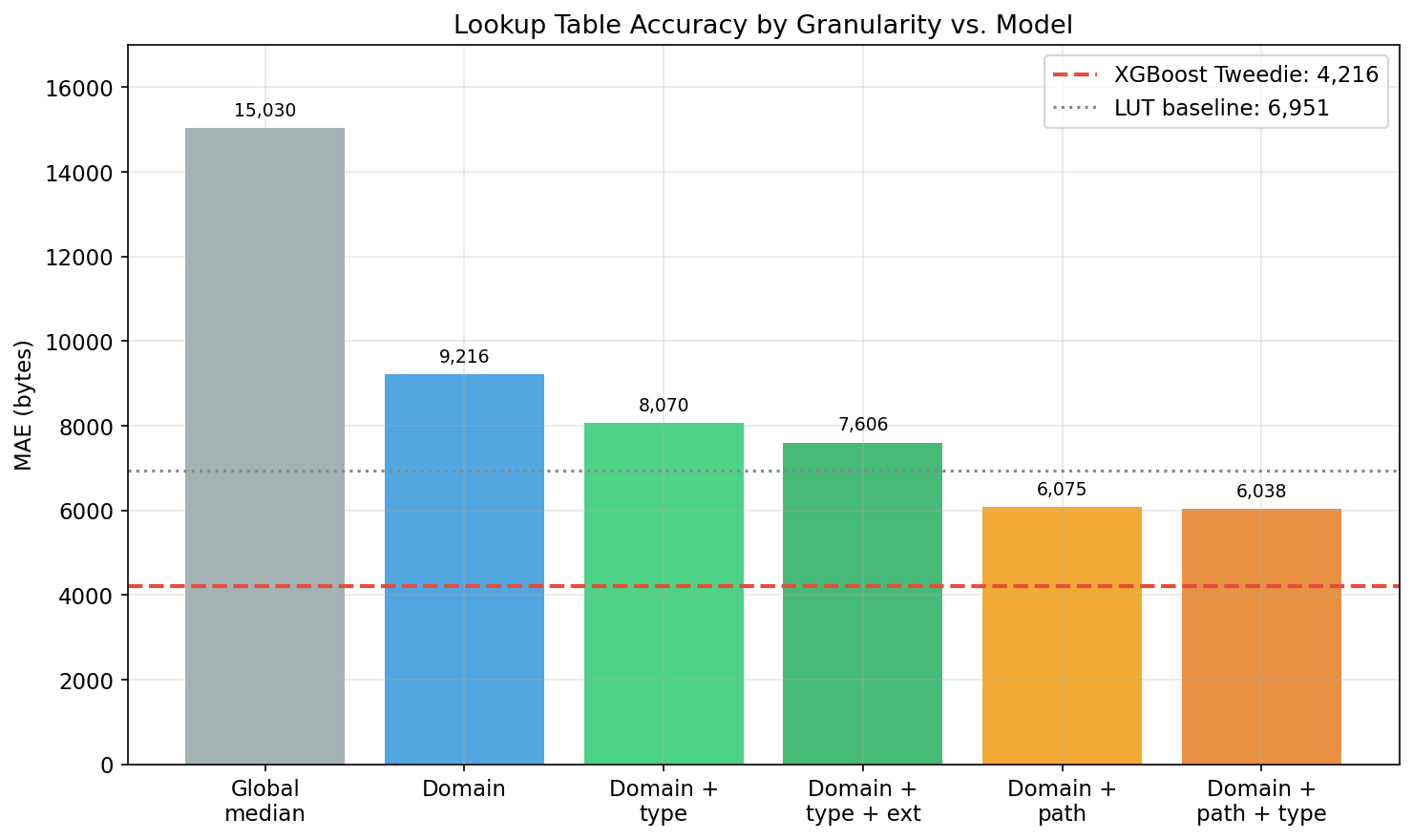
Per-domain scoring is insufficient. The same tracker domain serves resources of vastly different sizes depending on URL path and resource type: googletagmanager.com/gtag/js returns a 93KB script bundle, while googletagmanager.com/collect returns a 0-byte beacon. A domain-level lookup table cannot distinguish these cases, and a path-level table is infeasible (estimated 50M entries, 1.1GB compressed, immediately stale as tracker SDKs update). Section 7.1 of the paper confirms this negative finding: domain-level scoring does not benefit from ML, and a simple lookup table suffices at that granularity. The value of learned models is strictly at per-request resolution.
Data
3,490,824 tracker requests across 3,723 domains, drawn as a 1% stratified sample from the HTTP Archive June 2024 mobile crawl (full dataset: 348M requests across 5,186 domains). The transfer size distribution is zero-inflated and right-skewed (median 43 bytes, mean 13,607 bytes, max 8.6MB), which directly motivates the loss function choice.
Method
80 features across 5 groups, including TF-IDF + SVD (50 dimensions) over URL path tokens, resource type, request priority, initiator type, and target-encoded domain statistics. The TF-IDF+SVD representation subsumes hand-crafted regex features, eliminating the need for manual URL pattern engineering.
Loss function selection matters more than architecture selection. XGBoost with Tweedie loss (p=1.5) outperforms XGBoost with squared error by 23% on identical features and architecture. Tweedie is the correct inductive bias for this distribution: as a member of the exponential dispersion family, it naturally handles the point mass at zero and the heavy right tail. The variance function V(mu) = mu^p penalizes errors proportionally to predicted magnitude, concentrating model capacity on the high-cost requests that dominate user-facing aggregate estimates rather than wasting capacity fitting the mass of near-zero beacons. This is the key methodological finding — practitioners should select the loss function before tuning the architecture.
Multi-target training (transfer_bytes + download_ms jointly) does not improve per-request transfer size predictions, but auxiliary timing targets improve weekly aggregate accuracy, likely through implicit regularization of shared feature representations.
Results
Per-request accuracy. XGBoost Tweedie achieves MAE 3,466 bytes, a 47.5% reduction over the domain+type lookup table baseline (MAE 6,597). 95% confidence interval: [3,314, 3,627] from 1,000 bootstrap resamples. Spearman rho = 0.945. The model outperforms exact-path lookup even on matched paths (MAE 1,346 vs 1,448) — learned regularization beats memorization because the model generalizes across URL structural patterns rather than overfitting to specific path strings. Laplace-smoothed path LUTs (add-k, best at k=0.5: MAE 4,011) are 15.7% worse than the model and 4.9% worse than the unsmoothed path LUT; smoothing hurts because it degrades the 91.6% of matched paths to marginally help the 8.4% minority.
Weekly aggregation accuracy. At N=200 blocked requests per week, the model achieves 6.0% median error with 67.2% of weekly totals within 10% of truth, compared to 21.9% median error and 13.6% within 10% for the lookup table.
Temporal generalization. June-to-September evaluation shows 30.3% degradation in MAE, but the model retains a 32.8% advantage over the lookup table baseline. Correlated browsing (repeated visits to the same sites) doubles model error from 6.3% to 12.9% but nearly triples lookup table error from 22.2% to 36.4%, widening the model’s relative advantage under realistic browsing patterns.
Architecture comparison. Ten architectures evaluated. A character-level URL CNN achieves the highest ranking quality (Spearman 0.977) by learning URL representations directly from character sequences, but at higher MAE (5,320 bytes) than XGBoost Tweedie. The CNN demonstrates that end-to-end representation learning from raw URLs is viable for this task, though the tree model’s superior calibration makes it the better deployment choice for aggregate estimation.
Calibration. The model is well-calibrated for beacons (0–100B: 51.3% within 25%) and JavaScript bundles (50–100KB: 86.6% within 25%), but systematically underpredicts in the 500B–5KB range — the 500B–1KB bin has a predicted mean of 697 bytes against an actual mean of 2,144 (factor of 3). This mid-range gap (small JSON responses, CSS files) has limited impact on weekly aggregation accuracy because errors partially cancel across requests.
Figures


Deployment
The model ships as an ONNX export (200-500KB) via Firefox Remote Settings. Inference runs at request-block time in microseconds. Per-request predictions are aggregated into the privacy metrics card and new tab widget, enabling messages such as “Firefox saved you approximately 2.3MB of bandwidth this week.” Monthly retraining on fresh HTTP Archive crawls addresses temporal drift.